Consumer Psychology
Aesthetics
Branding
The Psychology of Pretty: Why Aesthetics Make Us Trust Brands
Think about the last thing you bought because it looked good. That split-second decision was almost intuitive. Like something in you was reaching out for it.
Marty Neumeier wrote in his book The Brand Gap:
“Why aesthetics? Because it’s the language of feeling, and, in a society that’s information-rich and time-poor, people value feeling more than information.”
And it’s true— we live in a swipe-right, two-second-attention-span economy. We judge faster than ever, and we do it with our eyes first. Aesthetics is no longer just an afterthought; it’s the handshake, the eye contact, the first line in the conversation between you and a brand.
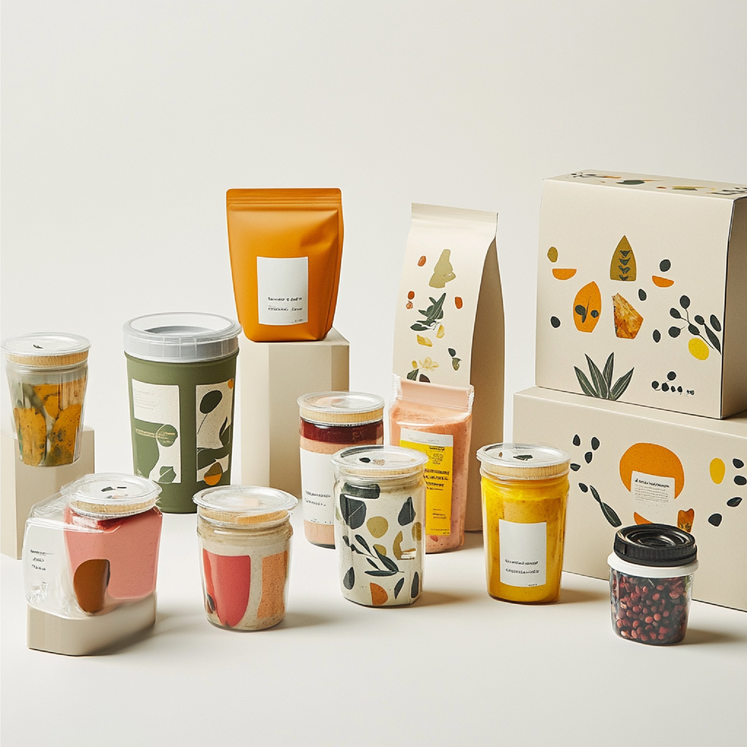
Psychologists call it cognitive fluency— the idea that our brains prefer things that are easy to process visually. Before we even experience a product, our brains are already making decisions about its quality and credibility based solely on its visual identity. It’s why we instinctively trust the weight of a Loewe shopping bag, the milky pastels of Rhode’s lip gloss tubes, or the minimal, monochrome bottles of Ouai. It’s the psychology behind aesthetics.
Aesthetics as Shortcut: Why Pretty Matters
There’s a cognitive cheat code at play here called the halo effect. When we get a strong first impression from something, our brains don’t stop to fact-check, they simply assume the rest is good too. A striking aesthetic can create that bias instantly, we let ourselves believe the product or brand in question will ultimately be as good as the aesthetics makes it look.
That’s why Apple’s loyalty runs deep. The elegance of their devices, the precision of their packaging, all signal intentionality. Owning one feels like you’ve joined a club that values design at a molecular level.
It’s the same reason a beautifully plated meal feels more delicious, a sleek app feels “easier” to use, or your coffee tastes better in a ceramic mug with just the right weight. And why a brand with gorgeous packaging can sell the exact same product that another brand has for triple the price.
Good aesthetics aren’t just decoration— they’re a trust signal. Even if the product is average, the right visual cues can upgrade its perceived worth in seconds. In that sense, a pretty aesthetic doesn’t just matter— it pays.
The Morton Salt Principle
Table salt is as basic as it gets. Chemically identical from one brand to the next, sold for pennies, and invisible in the finished dish. If ever there was a true commodity, this is it.
And yet, Morton Salt turned it into an American household name, not through innovation in the product itself, but through the look of it.
The little girl in the yellow raincoat, tipping an umbrella while the salt pours behind her, became more than packaging. It became an emotional anchor.
Marty Neumeier puts it best:
“There are no dull products, only dull brands.”
By wrapping something ordinary in an image that felt memorable, and trustworthy, Morton reframed table salt from a kitchen staple to their brand’s salt being the most wanted.
This is the quiet power of aesthetics: they can transform something we don’t even think about into something we look for. Morton didn’t just sell salt— they sold the feeling of a brand that cared enough to present itself with intention making them unforgettable.
Other examples doing it right
Rhode debuted with just three products: the Peptide Glazing Fluid, Barrier Restore Cream, and Peptide Lip Treatment. The mission was clear from day one: minimal, effective, affordable skincare staples.
And yet, Rhode didn’t enter the market quietly. It hit $10 million in sales in the first 11 days. That’s not just good skincare— it’s aesthetic dominance in action. Even the brand’s phone case, built to hold your lip gloss, became part of its visual language, blurring the line between beauty product and lifestyle accessory.
From its early clinical-white packaging to its now instantly recognizable pastel-capped bottles, Rhode’s visual evolution is a case study in emotional branding. In three short years, Rhode has proven that pretty isn’t surface-level, it’s strategy. The brand is paving the way for beauty companies that understand aesthetics as trust, design as emotional connection, and the essence of community.
And there’s Ouai, which isn’t just haircare; the vibes their products give off is very welcoming. When Jen Atkin launched the brand in 2016, she wasn’t just selling shampoo, she was selling a mood. The products are named like basic necessities (Detox Shampoo, Leave-In Conditioner) and packaged in clean, muted tones that looked just as good in your shower as they did in a sand pile.
Ouai nailed the balance between luxury and relatability. You could pick it up at Sephora without feeling like you’d emptied your wallet. Ouai proved that beauty brands could be sensorial storytellers.
Loewe proves that when a brand’s aesthetic feels honest, you believe in everything it sells. Under Jonathan Anderson, its visual language, earthy tones, tactile leather, handwoven baskets, all feels less like marketing and more like an invitation into a slower, more intentional world. The design consistency, from runway to packaging to store interiors, tells you this is a house that values craft that makes you feel more like yourself. Loewe is very intentional in how they position their aesthetic and it has continued to not only keep a loyal consumer base but also position them globally.
Why Now?
In a digital era, we’re living in a state of perpetual stimulation— phones pinging, screens glowing, tabs multiplying. The fatigue isn’t imaginary.
A Deloitte study found that about 32% of U.S. consumers reported feeling overwhelmed by the number of devices and subscriptions they had to manage during the COVID era, with the figure rising to 43% among parents juggling home life and tech demands.
In this context, aesthetic calm isn’t decoration, it’s respite. When we encounter a beautifully designed brand, our brains get a moment to breathe in the digital chaos.
Meanwhile, our collective visual literacy has also spiked. Platforms like Instagram and TikTok have trained us to scan and judge visuals in microseconds. Social media now allows you to curate your online persona based on your preferred aesthetic, this also extends to the type of brands you patronize, to match your aesthetics.
This heightened aesthetic sensibility, especially among Gen Z, means we’re now wired to seek emotional resonance in design. We don’t just want things to look good— we want them to feel right.
So here’s the point: Pretty isn’t superficial. In our current state of overstimulation, it’s exactly what soothes us. It’s a frontline strategy in earning attention, trust, and emotional connection. The most powerful brands right now aren’t the loudest– they’re the ones that look like a breath of fresh air and take your breath away with just a glance.
Final thoughts: The Feel-Good Factor
Aesthetics aren’t just nice, they’re necessary especially in current times. Beauty offers a rare pause. And beautiful aesthetics builds a community and pulls the crowd.
When a product looks good, we instinctively trust it a little more, and using it feels like an actual money’s worth.
Maybe, in the end, aesthetics really is the most honest thing a brand can offer.