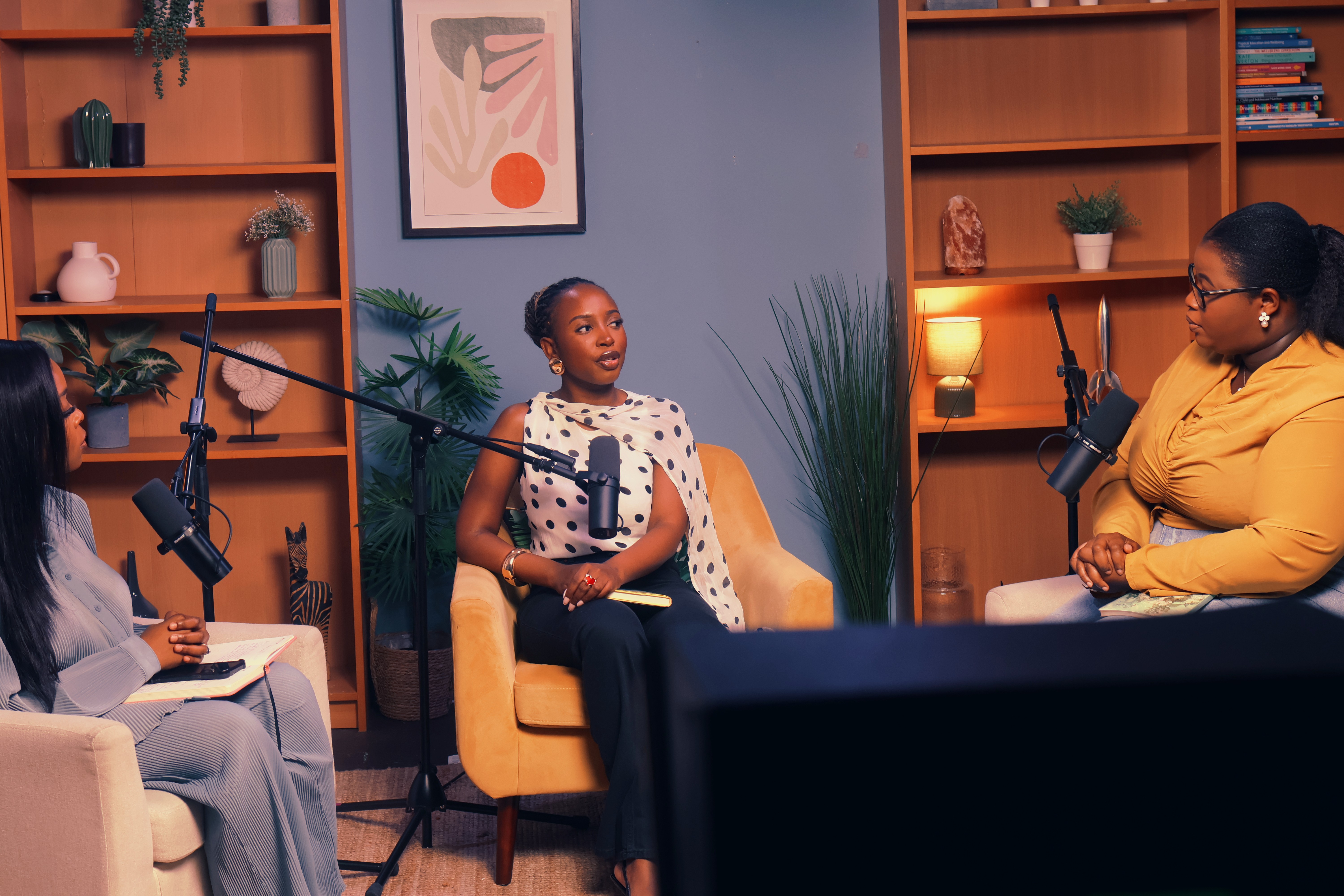
The show was already building an audience around honest, grounded conversations. But the visual and tonal presence had not caught up with the depth of what was being said. The brand needed to feel as anchored as the message itself, without losing the warmth that made people stay.
That was the brief.
We worked to define a brand voice that could hold both things at once. Rooted in truth and conviction, but personal enough to feel like a conversation with someone who genuinely gets it. That balance became the foundation for every decision that followed.
From there we led the full creative direction for the Why Series. Visual identity, colour, typography, lighting, graphic texture. Every detail was chosen to reinforce the same thing: a brand that speaks with clarity and shows up with confidence.
The result was a cohesive identity that finally matched the weight of the message.